How to set up a Facebook Lead Ad
Below is a click by click guide as to how best to set up your Facebook Lead Ads including best practice recommendations. We use Facebook Ads Manager to set up our ads and we don’t use guided creation. Please note, Facebook is always changing how it look but the principles of the choices you make when setting up the ads stay the same. In this instance our screenshots are accurate as of September 2020.
Click [Create]
Create your campaign
Your buying type should be Auction (as opposed to Reach & Frequency). This allows the system to take the opportunity to show your ads to the lowest cost user at the time. It’s possible you will underspend in an auction and there is no guarentee of reach. If you choose Reach & Frequency your reach is guarenteed but your results are not.
Choose Lead Generation for your objective, this will give you the option to create Lead Generation forms. This setting also tells Facebook to look for people who are likely to submit a lead.
Name your campaign - not really optional!
Our naming convention captures the information input at each stage.
Campaign: Our Name_Client Name_Campaign Name_Objective
Ad Set: Our Name_Client Name_Campaign Name_Objective_Audience
Ad: Our Name_Client Name_Campaign Name_Objective_Audience_Creative Variation
This helps for pulling data when reporting and knowing which ad sets/campaigns your ads belong to when you’re optimising.
When your ready to move on, click Continue.
Create Your Adset
Once you click Continue you will be pushed into your Ad Set settings.
Ensure your Ad Set Name is correct and remember to come back and update it if you make any changes to the audience that you’re targeting.
Select your Facebook page and accept the terms and conditions of the Lead Generation tool (make sure you read and understand them). Part of these T&Cs are that you need to have a privacy policy on your website, so if you don’t already have one, stop right now and get that online or you wont be able to progress to publishing your ad.
If you’re reading this I’m assuming it’s your first lead form so lets leave Dynamic Creative switched off for now, this is something to tackle when you get more advanced or engage an agency.
Budget and schedule. If you want to run your ads indefinitely and control how much you spend each day then a daily budget is a good place to start. However, we often use Lifetime budgets as it gives us more security that we won’t go over the set budget that has been approved by our client.
Set your audience
As mentioned in our blog post How to get quality leads from Facebook Lead Ads it’s recommended that you send you lead ads to a warm audience.
This means you’re likely to need to set up a custom audience such as ‘website visitors’ or ‘video viewers’.
Choose your placements
We always recommend going with Manual Placements. This is so you know exactly where youd ads will be showing and you can control how your ad shows up. If you have a budget over about $500/month for the Ad Set it can be worth splitting up the placements and running one adset for Facebook and one Ad Set for Instagram.
If you have a smaller budget you can run them together and use the ‘breakdowns’ in the reporting tools to asses the succes of each placement.
Scroll through and tick the placements that you want your ad to show in. If you’re not sure what the placement is, hover over it an you will get a preview on the right hand side.
When it comes to setting up your ad, you’re able to edit how the ad looks for each placement. If you choose a varity of placements this is recommended.
After placements is Optimisation and Delivery. Double check that your optimisation is set to Leads. If it’s not head back to your campaign and double check your objective settings.
I’d recommend not adding a cost control in until you’ve collected some data and you know how much it’s going to cost you to generate leads. Once you know how much is an achievable CPL you can start to set limits on Facebook to not spend more than a certain amount to gain a lead.
When you’re finished setting up your adset click Next.
Time to set up your ad
Check your ad name is correct. You may need to update this if you made any changes to the set up along the way (i.e if you tweaked your audience from what was initially planned).
Select the Facebook and Instagram page that you want your ads to run on and choose if you want a single image or video or a carousel.
Carousel ads are highly effective at generating clicks and video ads allow you to convey complex information so choose the one that makes the most sense for your brand and what you’re asking your audience to do.
Set up your creative
Choose your image, if you only have a few static images you can use Facebooks tools to make a slideshow. This isn’t as good as a video but the movement can help capture attention and increase cut through on the newsfeed.
Add in the text making sure you’re checking the preview to see how it shows up. Make sure you have the hook right at the start so if your message gets truncated people are incentivised to click “see more”.
You also want to use every opportunity here to add a call to action and inform people of what you’re going to do.
I.e “Sign up and we will call you” “Sign up to recieve an email” “Book now for a call back”
Make sure your CTA matches the button you choose to use on your ad.
Create your lead form
The last step is to create your lead form. You can duplicate a previous form and make changes or create a brand new form. Note, once you save a form you can’t edit it, so to make changes you’ll need to duplicate and remake the form amending any mistakes.
Click Create Lead Form to get started.
Populate your form
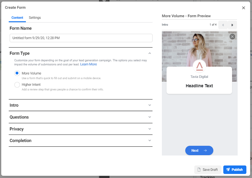
Work through the content tab starting with the Form Name. These need to be unique and it’s likely you’ll have V1, V2, V3 as you make tweaks to your form so name it something simple that makes sense to you.
Form Type refers to how the user confirms their data. More Volume will encourage leads to breeze through the form quickly. Higher Intent will give them more steps to confirm the info that they’re submitting to you. If you start with More Volume and you find you’re getting low quality leads then switch to High Intent. If you start with High Intent and you’re not getting as many leads as you like, try switching to More Volume. If you intend on testing these variables make sure the option you pick is detailed in the Form Name.
For the Intro use the same image as your ad as it helps people orientate where they are. If it doesnt show up properly because the ad dimensions don’t align with the lead form preview, make sure you’re cropping the image to fit and uploading it as a new image rather than having “use image from your ad selected”.
Populate the greeting section telling people what they’re submitting their infomation for and what will happen after they submit their info.
Moving onto Questions. Select as few questions as you can to get the information that you need. The more questions the less likely someone is to complete the form.
In the Privacy section you’ll need to link to your Privacy Policy. This is a non negotatiable and you can customise the link that shows here but that’s not entirely necessary.
The completion section is like your thank you page. Remember to remind people what will happen with their information, i.e let them know when to expect a call form you. and you can continue them on their journey by sending them to a relevant page on your website.
Optimise your form settings
Under Form Configuration you want to select ‘open’ this will allow people who come across the form organically to submit a lead. If you need to be very careful about who you’re targeting, i.e if you’re an alcohol brand you may want to leave this as ‘restricted’ so only the people who get targeted with the ad can fill out the form.
Field names are only relevant if you’re connecting to a CRM and you need to customise the data that gets sent through from your form.
Tracking parameters allow you to add extra information into the form that will get passed through into your CRM.
When you’re finished your form you can press the arrows in the top right hand corner of the preview to review the form. As mentioned above, once published you can’t make edits so review your form carefully. When you’re happy with your form, click Publish.
Congratulations! You’re finished! Now you need to publish your ads and you’re on your way to generating leads for your business.
If you’d like to investigate having someone manage your Facebook campaigns for you, you’re welcome to get in touch with us and we’re happy to have a chat.


